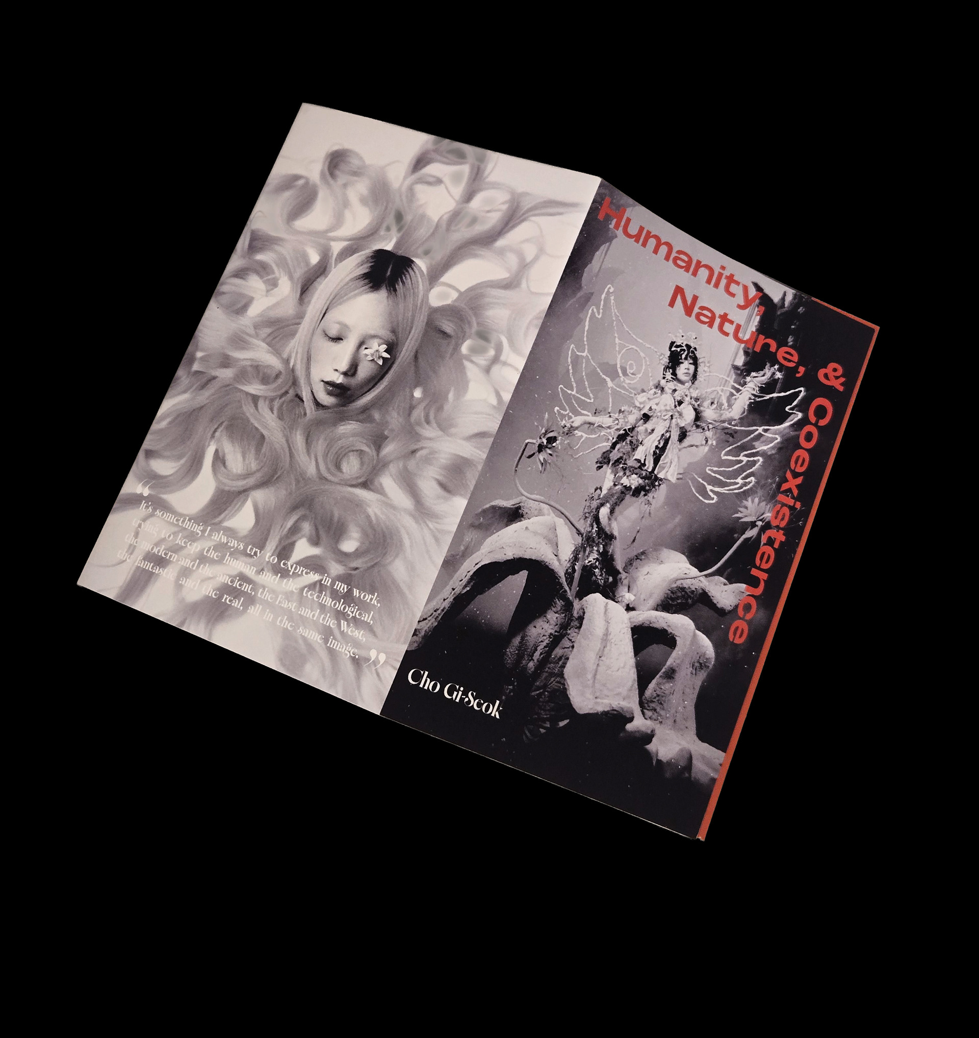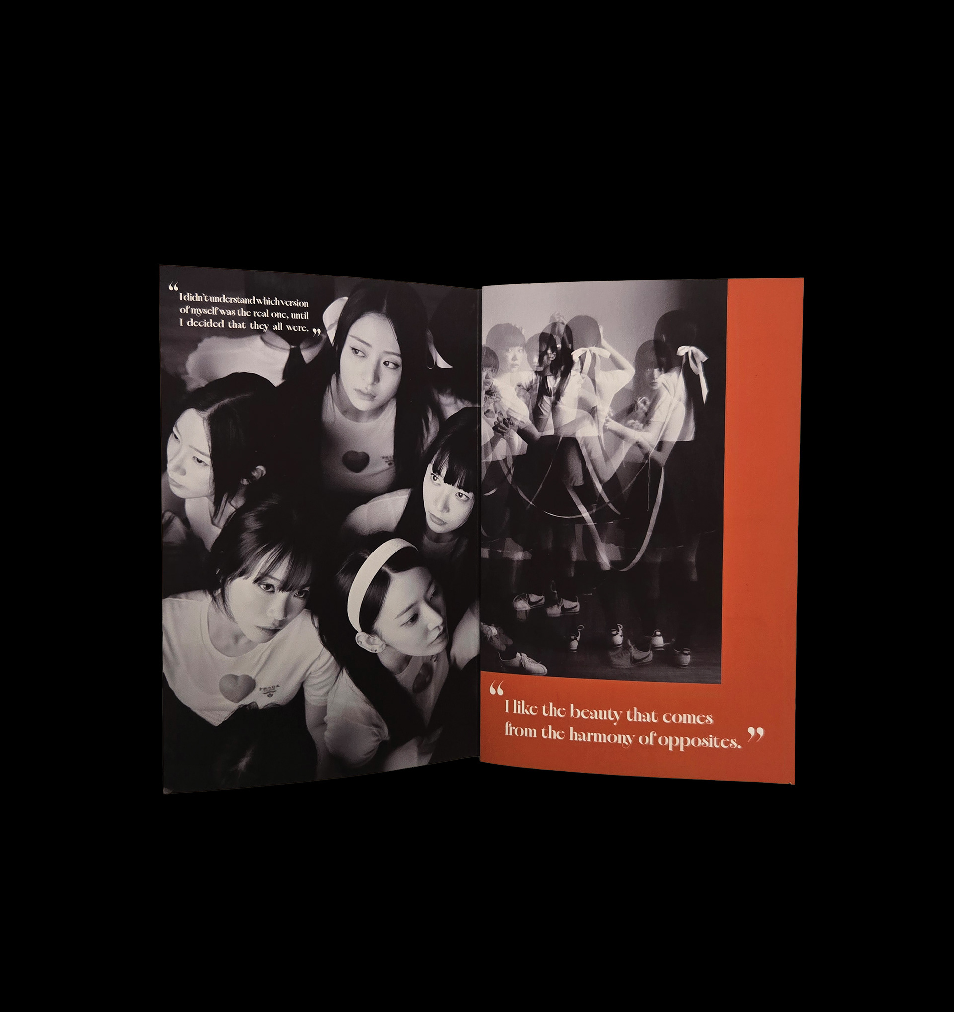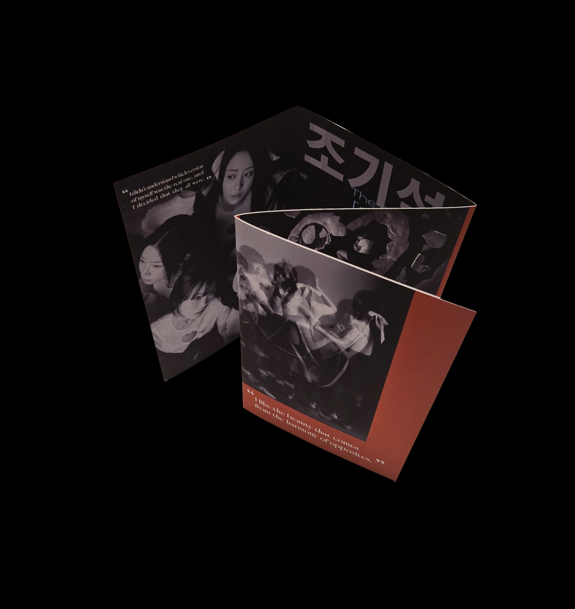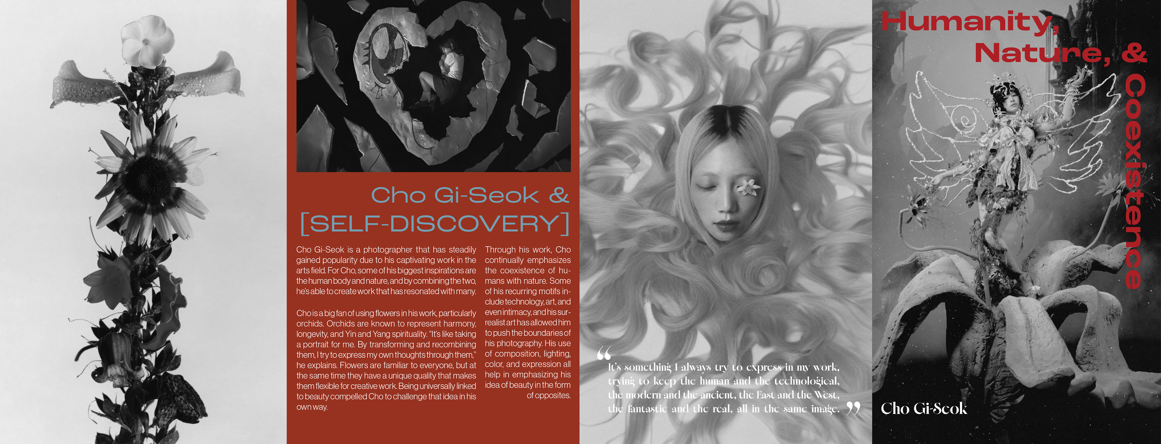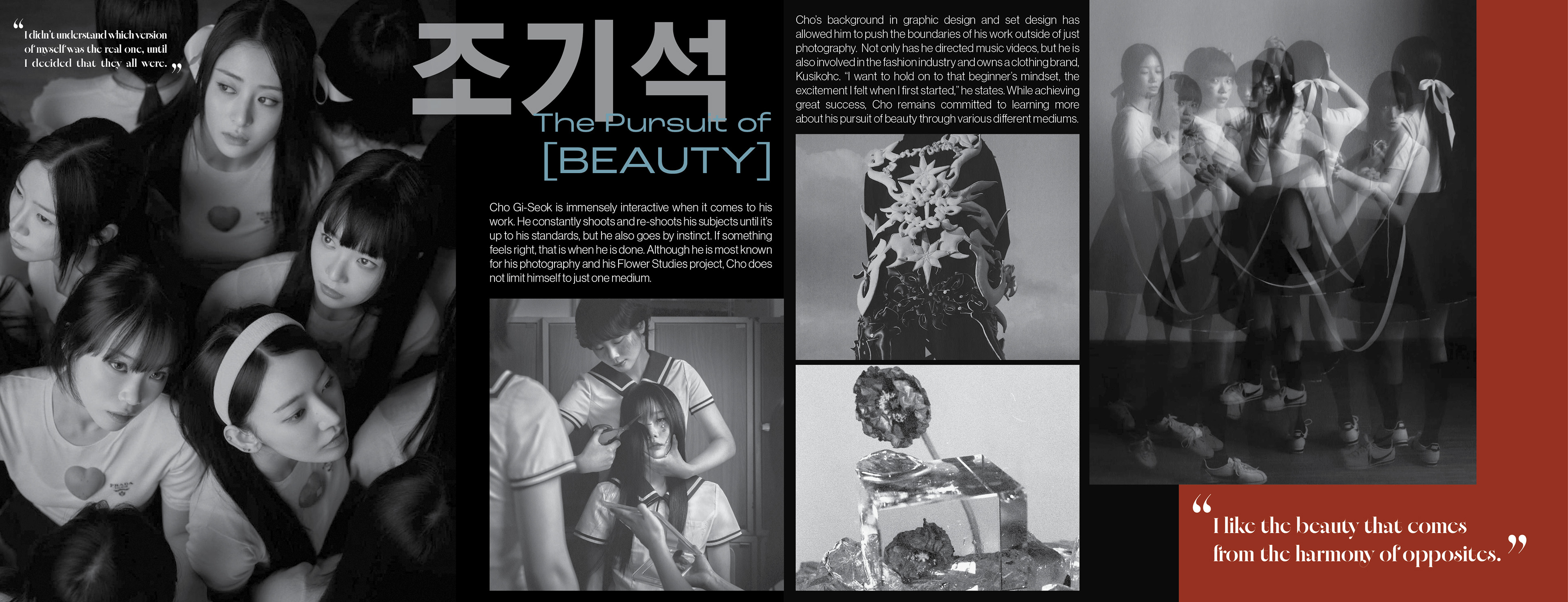
Cho Gi-Seok is a South Korean photographer known for his surrealism and inclusion of clashing concepts. Some of his most popular photography includes the idea of “the harmony of opposites,” and “coexistence.”
One of the only constraints about creating this brochure was the photography, as it had to be in black and white. This meant that the photographs included are some of the ones that allow Cho Gi-Seok’s main ideas and concepts to shine. It showcases some of his most common motifs: nature, intimacy, the human body, and tears to name a few.
Without color, his photographs become very haunting, which creates a bit of contrast, as his work includes a lot of vibrant and moody colors. Red and blue are used a lot in his photography, which is the reason those are the main colors chosen for the overall design of the brochure.